
Blog Post
Insight: Commuting Patterns in Utah, 2000 to 2010
By: Natalie Young
Jan 22, 2020 – Today we release “Moving Toward 2020: Utah Commuting Patterns, 2000 to 2010,” which reviews home-to-work commuting patterns across the state from a county-level perspective. Understanding the status of commuting in 2010 prepares us for future analysis of the recently completed decade as more commuting data become available.
Quiz yourself on commuting in Utah: (answers at end of blog)
- Which county has the greatest share of residents who travel to work in another county?
- Which two counties have the strongest commuting relationship in the state?
- Which county has the strongest commuting relationship with Salt Lake County?
To delve into county-to-county commuting bonds, we created an “interchange score” measure. This analysis examines, for each county in a pair, shares of the county’s workers who commute to the partner county as well as shares of employment (jobs) supplied by the partner county. The score measures the commuting “connectedness” of two counties, rather than just the sheer numbers of commuters between them. See, for example, the interchange scores for counties when paired with Salt Lake County:
Top Commuting Relationships with Salt Lake County using Interchange Score, 2010
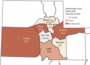
Source: Kem C. Gardner Policy Institute analysis of Census Transportation Planning Products 2010 (2006-2010 Data)
A higher interchange score demonstrates a stronger inter-county commuting relationship. Tooele County has the strongest ties to Salt Lake County, scoring 25.4, closely followed by Davis County (24.8), with Summit and Utah counties in third and fourth place. Though Salt Lake County sends less than 1% of its workers to Tooele County and just 1.6% of its workers are from Tooele County, the incoming workers represent over 37% of Tooele’s working residents. Workers from Salt Lake County also cover nearly 12% of the jobs in Tooele County. These proportions are what influence the interchange score and result in the Tooele-Salt Lake pair of counties scoring higher than the Davis-Salt Lake pair (yes, I’ve given away the answer to question C).
The report also shares the strongest scores for county pairs in other areas of the state, highlighting strong commuting bonds outside the Wasatch Front such as Carbon and Emery counties and Summit and Wasatch counties. A rich set of appendix tables includes the amounts of commuters between any pair of counties in the state, their net commuter flows, their numbers of out-of-state commuters, and more.
The report uses the key source for commuting to work data, collectively called the Census Transportation Planning Products (CTPP), for 2000 and 2010. CTPP data are special tabulations of the U.S. Census Bureau’s large survey datasets for use in the transportation planning community. This research builds on three decades of past CTPP data analysis by Dr. Pamela Perlich, our Director of Demographic Research: “Commuting Patterns in Utah: County Trends for 1980, 1990, and 2000” in sharing notable commuting changes from 2000 to 2010.
Answers (All refer to CTPP 2010 data):
- Morgan County. Morgan sends 61.3% of its working residents to other counties for work, followed by Davis County (46.9%) and Tooele County (44.6%). By sheer numbers, however, Davis, Utah, and Weber Counties have the most out-commuters.
- Davis and Weber counties. See “County-to-County Interchange Scores” in the report.
- Tooele County. By our measure, Tooele County’s bond with Salt Lake County is a little stronger than Davis County’s or Summit County’s. See “County-to-County Interchange Scores” in the report.
Notes: CTPP 2010 data covers a survey period of 2006-2010. Interchange scores potentially range from 0 to 200. See p.9 and Appendix 6 of the report for more details on score calculation.


