Blog Post
Insight: Just Going With the Flow: County-to-County Migration Data Update

By: Emily Harris
Note: The opinions expressed are those of the author alone and do not reflect an institutional position of the Gardner Institute. We hope the opinions shared contribute to the marketplace of ideas and help people as they formulate their own INFORMED DECISIONS™.
The Census Bureau just released the county to county migration flows identified in the 2014-2018 American Community Survey.[i] This data details every migration flow (in and out) between every county in the United States. Pretty cool, right? These gross flows are really helpful. Normally, the most widely available migration measure is net migration (in-migrants minus out migrants). Even though net migration is a useful metric, in reality, no one has ever met a “net-migrant”. So let’s dive into the migration flows.
Utah attracts most of its migrants from neighboring states in the West, such as Idaho, Arizona, Nevada, and California. This is generally true within Utah at the county level, as well. There is a ton of data to mine out of this release, so I thought I would take a more focused approach by comparing Salt Lake County and Utah County to see how they relate and comingle.
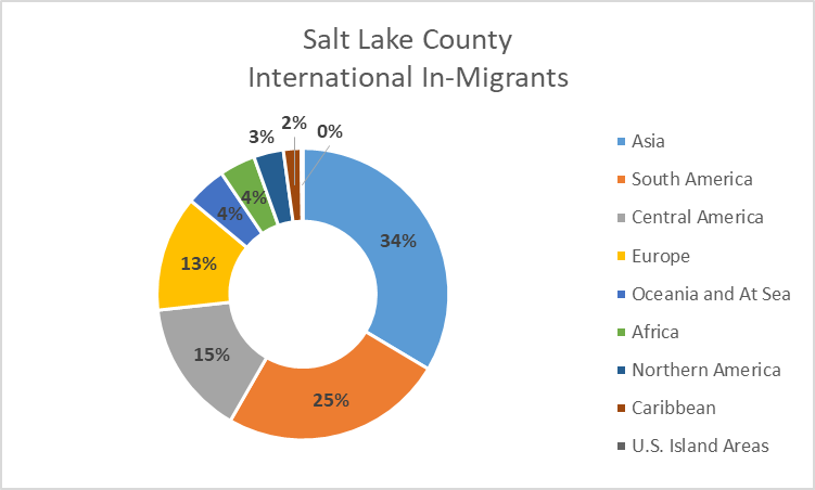
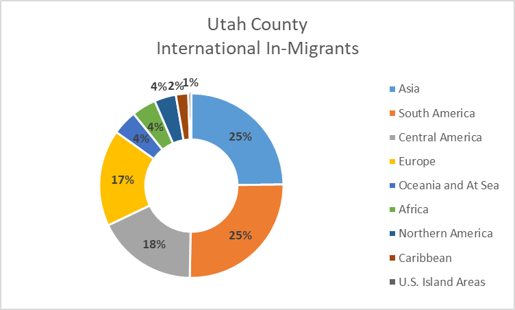
Salt Lake and Utah County both attract a large number of migrants from foreign countries. The largest number of immigrants in Salt Lake County hail from Asia, while Utah County’s largest share are from South America.
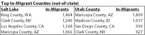
If we look domestically at top source counties outside of Utah we find that Nevada, Arizona, and California rank highest, but in different orders:
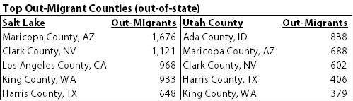
There’s a similar, regional pattern when we look at the out-migrant destination counties outside of Utah, with an addition of Harris County, TX (Houston area):
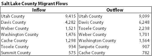
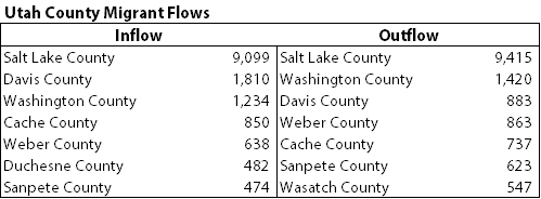
Within Utah, we see predictable migration patterns between counties. Salt Lake County receives and sends many people to and from the major Wasatch front counties: Utah, Davis, and Weber counties. But there are also strong flows between Washington, Tooele, and Cache counties. These same trends hold for Utah County, though Sanpete and Wasatch counties have stronger ties to Utah County, and we see those migration flows pop up in the Utah County rankings.
While migration patterns are somewhat similar between these two counties, it’s important to note that the kinds of people, and the reasons for migration, can be different across these counties.[ii] Both counties attract college age students and skilled laborers. But we also know that Salt Lake County attracts many refugees, more racially and ethnically diverse individuals, and young adults who prefer to live in a major city with smaller households; while Utah County attracts many religious missionaries (especially returning from abroad), and those with larger families.
Two more important points:
– This data set does not capture those who move to another country from the U.S., so we cannot examine international out-flows or net migration.
– These patterns describe the 2014-2018 time period, a very prosperous time for Utah, the region, and the country as a whole. We are now in an economic recession and in the middle of a global pandemic, so we cannot assume that these patterns are currently holding true.
If you would like to dig into this data yourself, the Census Bureau has a great, mapping interface that allows you to visually analyze and choose your county of interest. For the Census Flow Mapper, click here.
We anxiously await future data releases that incorporate this Covid-19 period!
Emily Harris is a demographer at the Kem C. Gardner Policy Institute.
[i] Source: U.S. Census Bureau, 2014-2018 American Community Survey. For more information, see https://census.gov/acs
[ii] Harris, E., & Perlich, P. 2019. Utahns on the Move: State and County Migration Age Patterns. https://gardner.utah.edu/wp-content/uploads/MigrationReport-Sep2019-Final.pdf